- Press Release
- 2022/09/01
NERV Disaster Prevention App, Enhanced Accessibility Functionality
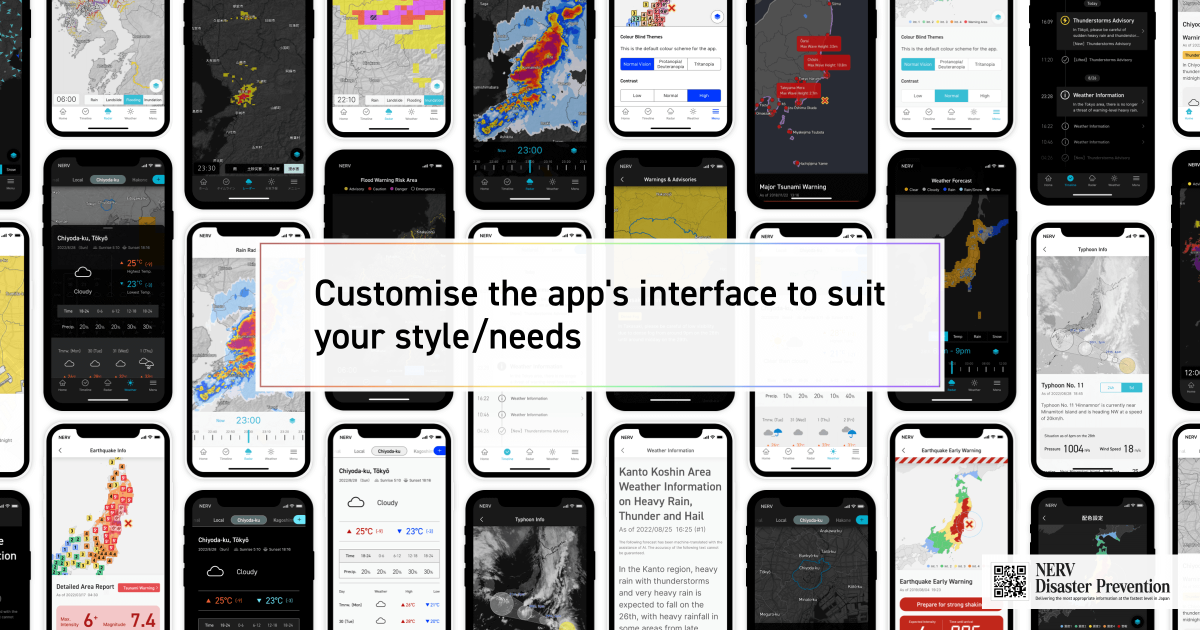
Gehirn Inc. (Headquartered in Chiyoda-ku, Tokyo; CEO: Daiki Ishimori; hereinafter referred to as 'Gehirn'), has released the version v4.0 (:3.0+1.0) update for the NERV Disaster Prevention app on the 1st of September 2022 (Disaster Prevention Day). The update brings significantly enhanced accessibility features.
New Themes
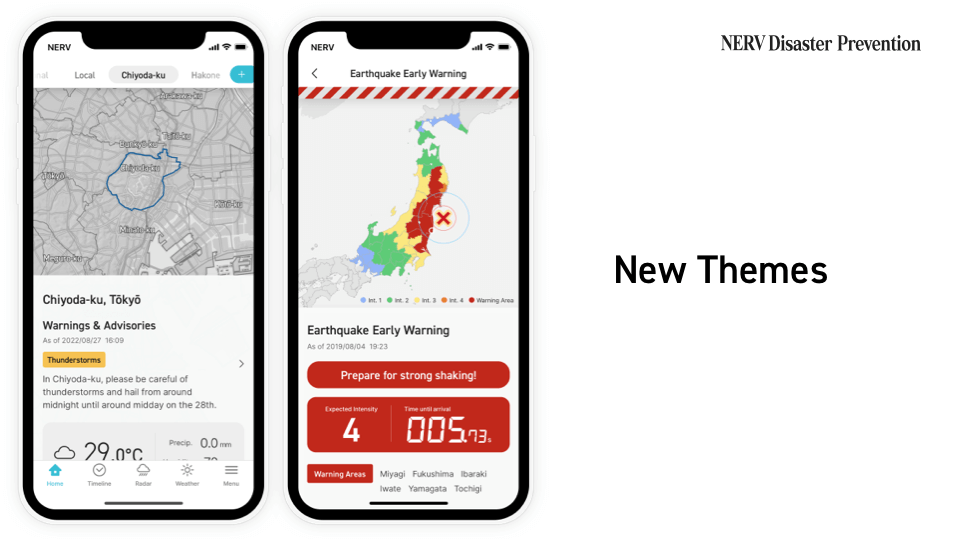
Since the release of the NERV Disaster Prevention app in 2019, the app has consistently conveyed disaster prevention information in a high-contrast colour scheme based on a dark theme. This interface has been well received by many users, but as the app’s user base has expanded, we have received numerous requests to implement a light theme.
In September 2021, we began designing a new colour scheme within the company, known as the “SHIN-Theme” (or “New Theme”). The aim was to create a fresh, beautiful, highly visible and sophisticated colour scheme, like a white sandy beach. Releasing the “SHIN-Theme” was not just a matter of inverting the existing colour scheme. In addition to redesigning the colour scheme of every screen in the app, it was necessary to implement a dynamic colour theming system, and to re-implement all user interface components, including the map’s colour scheme, the map system/image generation engine and widgets.
With the June 2022 release of app version v3.3.1, the switch from a map product provided by an external map service provider to a map system with an in-house map engine and map data that we can maintain ourselves, a change that was made in anticipation of this update and was one of the key milestones that formed the basis for the implementation of the “SHIN-Theme”.
18 colour schemes for different colour vision abilities
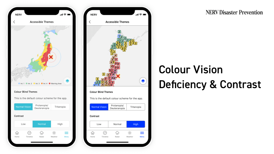
Although we tried to design a single colour scheme that could accommodate as many different types of colour vision deficiencies as possible, it’s not possible to accommodate both Protanopia/Deuteranopia (red/green colour blindness) and Tritanopia (blue/yellow colour blindness) in a single theme. If we tried to accommodate both types of colour vision deficiency, the colour scheme would be based only on shades of a grey scale, which is called Monochromacy (achromatopsia), and would be difficult to use for people with standard colour vision. For this reason, we have made it possible to select colour schemes optimised for each colour vision type: “Normal Vision”, “Protanopia/Deuteranopia”, and “Tritanopia”.
We also received a number of requests for improved contrast. Some users with visual sensitivities said that the previous dark colour scheme was too high-contrast, and too visually stimulating, while others said that the contrast ratio was not high enough. With this update, we have also made the contrast adjustable to “Low”, “Normal”, and “High”.
These choices made it necessary to use a total of 18 colour schemes, consisting of two base themes (Dark and Light), three for varying types of colour vision (Normal, Protanopia/Deuteranopia and Tritanopia), and three contrast levels (Low, Normal and High). As these 18 colour schemes were designed for every screen, the amount of work involved was enormous.
Colour vision deficiency can be congenital, due to heredity, or acquired, due to injury, disease, or age. Age-related changes in colour vision are said to occur to most people in their 80s, making it difficult to see light and blue colours. These users can improve their colour perception by selecting “Tritanopia” and “High Contrast”.
No matter how fast push notifications are sped up from the perspective of “conveying information as quickly as possible”, if users are confused by the colours displayed on-screen, that one second created by speeding up the process will pass by in the blink of an eye. We believe that it’s very important that users are not confused by the colours we use in our products, in order to help them make their decisions as quickly as possible.
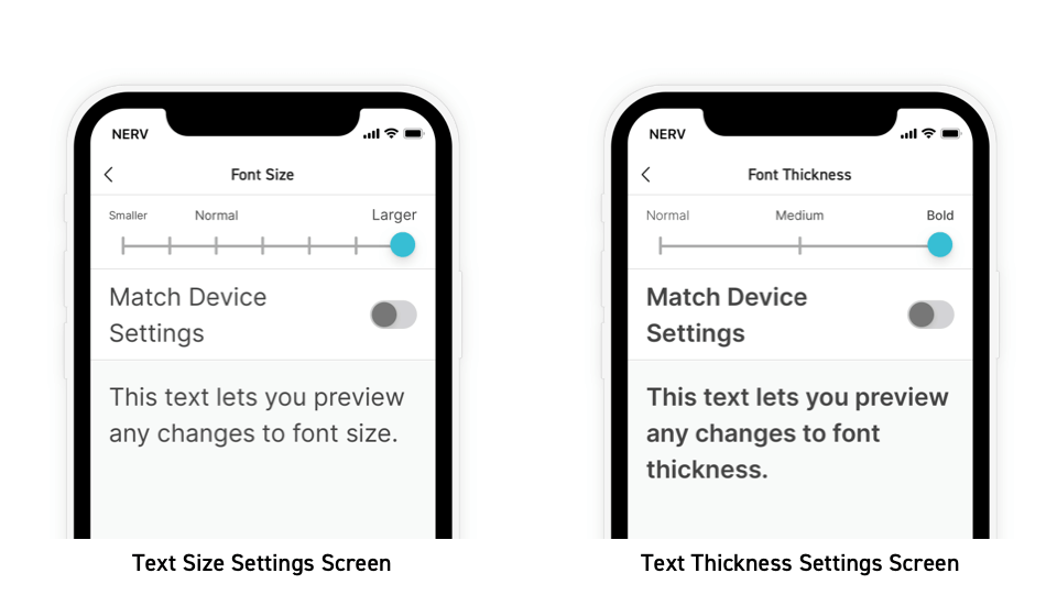
Text Display Settings
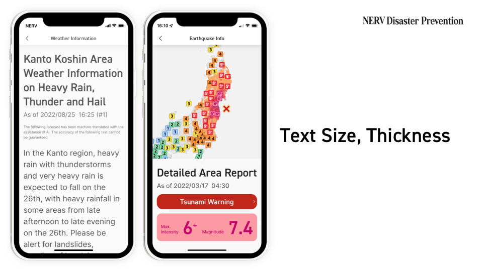
We’ve received a number of comments saying that the text was too thin, and caused some users minor visual disturbances, or that the text was too small and it was difficult to read. In response to these comments, we’ve made it possible for users to configure the font size and thickness (font weight) of the text.
By optimising the font size and thickness, we hope to encourage users who usually don’t read the long-body text information, such as general and prefectural weather information reports because the text is too small, to read this type of weather information appropriately.
On the other hand, the text can also now be made smaller, taking into account younger users, as well as users with narrowing of the visual field or other visual field defects. Text can be made two steps smaller, and four steps larger than the default. Additionally, by checking the “Match Device Settings” check box, the same font size and font thickness as configured by you in the OS’ settings are automatically applied, so users who have set “Larger Font” in the iOS Dynamic Type menu can also use their preferred settings.
Screen Reader Layout
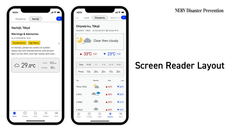
For users using VoiceOver or TalkBack, you can now choose to use the “Screen Reader Layout” in Appearance settings. If this function is enabled, the map in the application is omitted and the layout is changed to one that is easier to interact with a screen reader. The content of the readouts has also been optimised to be more suitable for auditory communication. For example, when the focus is on the weather section of the home screen, the screen reader will read out “It’s currently 25.5 degrees and cloudy. Recorded 0.0mm of precipitation in the past hour. 77% humidity”; when the weather forecast tab is displayed, you’ll hear “Today’s forecast is cloudy”, and “Today, expect a high of 27, 1 degree warmer than yesterday, and a low of 20, the same as yesterday.”
The layout and readouts for screen readers still have a lot of room for improvement, so if you have any suggestions or recommendations, we’d love to hear your feedback.
Everyone should be able to access information by means and in formats that suit them
We’ve been working on the subject of information accessibility for several years now. Accessibility, in our view, means that everyone should be able to access information in a means and format that suits them.
We’ve been looking for ways of conveying information that don’t rely on just one of the three senses - colour, sight and hearing. We have taken the utmost care to ensure that information is conveyed not only by colour, but also by text, and not just by text, but also by sound.
Language barriers are another accessibility issue. For last year’s anniversary update, we worked on English language support to make information accessible to an even wider audience. For 2022, we worked on developments to make information even more accessible for visual, colour, and auditory communication.
The amount of design and development work was huge, as every screen had to be redesigned, and it was a long 11 months of development. We’re happy to finally be able to release this update. We hope that our work will be a step in the right direction for information accessibility in Japan.
Gehirn will continue to further strengthen its disaster prevention information distribution capabilities.
■ Corporate Overview
URL: https://www.gehirn.co.jp/
Est. 2010/07, Gehirn is an IT and Security company that provides 'Gehirn Web Services' (an infrastructure service), Corporate Vulnerability Analysis, and Disaster Preparedness and Weather Information distribution services, all focused around our mission to 'Make Japan Safer'.
■ For other inquiries, please contact us
Gehirn Inc. (ゲヒルン株式会社)
Contact Form: https://www.gehirn.co.jp/en/contact/